Opening a long list of memos titled "Notes", "Ideas", "Stuff", and "Misc" is a small daily frustration that compounds over time. You know what you wrote — you just can't find it without reading every title. Colour labels solve this instantly: the right colour system turns your memo list into a visual dashboard where every category is recognisable before you've read a single word.
This guide walks you through building that system from scratch — which colours to assign, how to use pinning to reinforce it, and how to keep the whole thing from collapsing under its own complexity. If you haven't explored the full range of things Memo Notepad can do, start there first — colour-coding is most powerful when you already have a few distinct use cases in mind.
Why Visual Organisation Works Better Than Search Alone
Search is powerful, but it requires you to remember a keyword. Colour recognition is instant and requires nothing — your brain processes a colour stripe on a memo card before you've consciously read the title. Research in visual cognition consistently shows that humans can distinguish and locate colour markers in a list roughly four times faster than scanning text alone.
A well-designed colour system means that when you open Memo Notepad, you can answer "where is my urgent client deadline?" in under two seconds without typing anything. That small saving, repeated dozens of times a day, adds up to something real.
The Core 5-Colour System
This system works for students, professionals, writers, and everyday users. Each colour maps to a distinct mode of thinking, so there's rarely ambiguity about where a memo belongs.
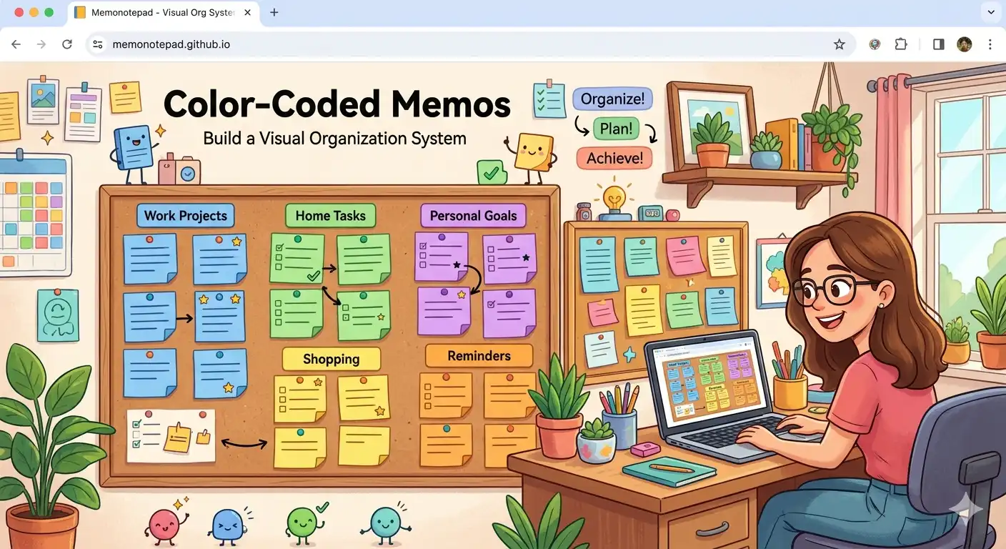
What Your Dashboard Looks Like After Setup
Once all your existing memos are labelled, your sidebar stops being a plain list and becomes a scannable dashboard. Here's what a typical working day looks like at a glance:
Your two most important memos are pinned at the top. Below them, the colour stripes tell you exactly what each remaining memo contains — no reading required. This is the notepad equivalent of a well-organised desk.
Pinning Strategy: Making Your Dashboard Actionable
Colour labels handle recognition. Pinning handles priority. Together they form a complete organisational system. Here's the pinning strategy that works best with the 5-colour system above:
Pin your most urgent coral memo
Any memo carrying a deadline or urgent task should be pinned until it's resolved. Seeing coral at the very top of your list every time you open the app is a gentle but persistent reminder.
Pin your daily "Today" teal memo
Create one teal memo each morning titled with today's date and your three priorities. Pin it. This becomes your anchor for the day — always visible, always relevant, unpinned and archived each evening.
Pin at most three memos at once
Pinning loses its meaning if everything is pinned. Treat the pinned area as premium real estate — only the two or three memos that genuinely need to be top-of-mind right now earn a spot there.
Unpin completed memos the same day
A completed task staying pinned creates clutter and dilutes the signal. Make a small ritual of unpinning finished items — it also doubles as a satisfying moment of closure.
Let reference and idea memos float unpinned
Blue reference and amber idea memos rarely need to be pinned. Their colour stripe is enough for quick visual recognition when scrolling. Save your pins for things that require action.
Keeping the System Alive: Common Pitfalls
Most colour systems collapse for one of three reasons. Here's how to avoid each:
Pitfall 1: Too many colours
Adding a new colour for every slightly different situation is tempting. Resist it. When you have ten colours, none of them carry meaning anymore — your brain stops processing them as categories and starts ignoring them as decoration. Five is plenty. If you genuinely need a sixth, retire one first.
Pitfall 2: Inconsistent titles
Colour gets you to the right region of your list; the title gets you to the exact memo. Both need to work together. Use descriptive, specific titles: "2026-06 Client Meeting — Action Items" beats "Meeting" every single time. Good titles make the search feature dramatically more useful — two typed words should be enough to find anything.
Pitfall 3: Not reviewing old memos
A colour system degrades when resolved tasks stay teal or stale ideas stay amber. Build a brief weekly review into your routine: scan for teal memos that are finished (archive or delete), amber memos that went nowhere (delete), and coral memos that are no longer urgent (reclassify). The whole review takes five minutes and keeps your dashboard clean. You can also export your full memo archive as a JSON backup before a big cleanup session — good insurance against accidentally deleting something useful.
- Assign colours at the moment of creation, not later — the habit only sticks if it's immediate
- Decide your colour meanings once and write them down somewhere permanent
- Review and reclassify memos every Sunday evening (takes under five minutes)
- Delete freely — you can always export before a cleanup as a safety net
Advanced: Adapting the System for Specific Workflows
The core 5-colour system is a starting point. Here are three common adaptations:
For students: Replace "Personal" purple with a subject-specific colour — one colour per course. Use amber for assignment drafts, teal for lecture notes that need review, and coral for upcoming exam deadlines.
For developers: Sky blue works well for code snippets and API references, teal for active feature work, and amber for architectural ideas worth exploring. The local-only storage means sensitive config memos stay genuinely private regardless of their colour.
For writers: Amber for raw ideas and first-draft fragments, teal for pieces actively in revision, sky blue for research, and purple for personal journal entries that feed your writing. This mirrors a typical writing pipeline and lets you see at a glance how much material you have at each stage.
Frequently Asked Questions
Start Your Colour System Today
The best time to set up a colour system is when you're starting with a blank memo list. The second best time is right now. Open Memo Notepad, go through your existing memos, and spend five minutes assigning a colour to each one using the five categories above. You'll immediately see your list transform from a wall of text into a scannable visual dashboard.
Once your system is in place, pair it with keyboard shortcuts for faster navigation, and make sure you've set up a regular backup routine so your organised collection is safe across browser clears and device switches.